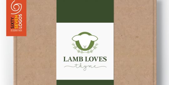
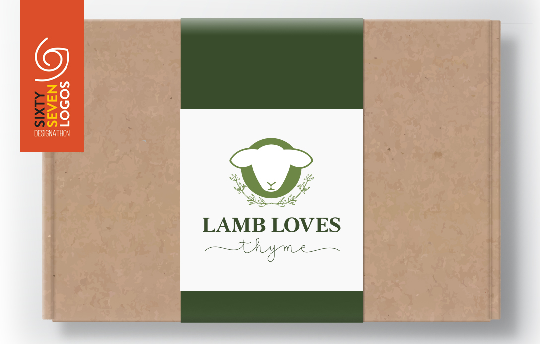
We participated in the 67 logos designathon held by CWDI again this year, and loved it! Our client was Lamb loves thyme and they wanted a logo that was clean and sleek, simple and timeless which included the icon of a lamb and thyme. We were both incredibly pleased with the result and client loved [...]
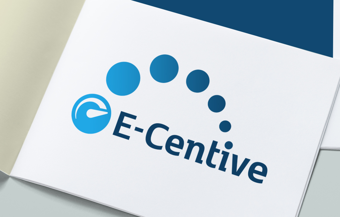
E-Centive
LOGO DESIGN
E-Centive were looking for an enhancement on their logo, they wanted something slightly brighter with more 'pop' and depth.
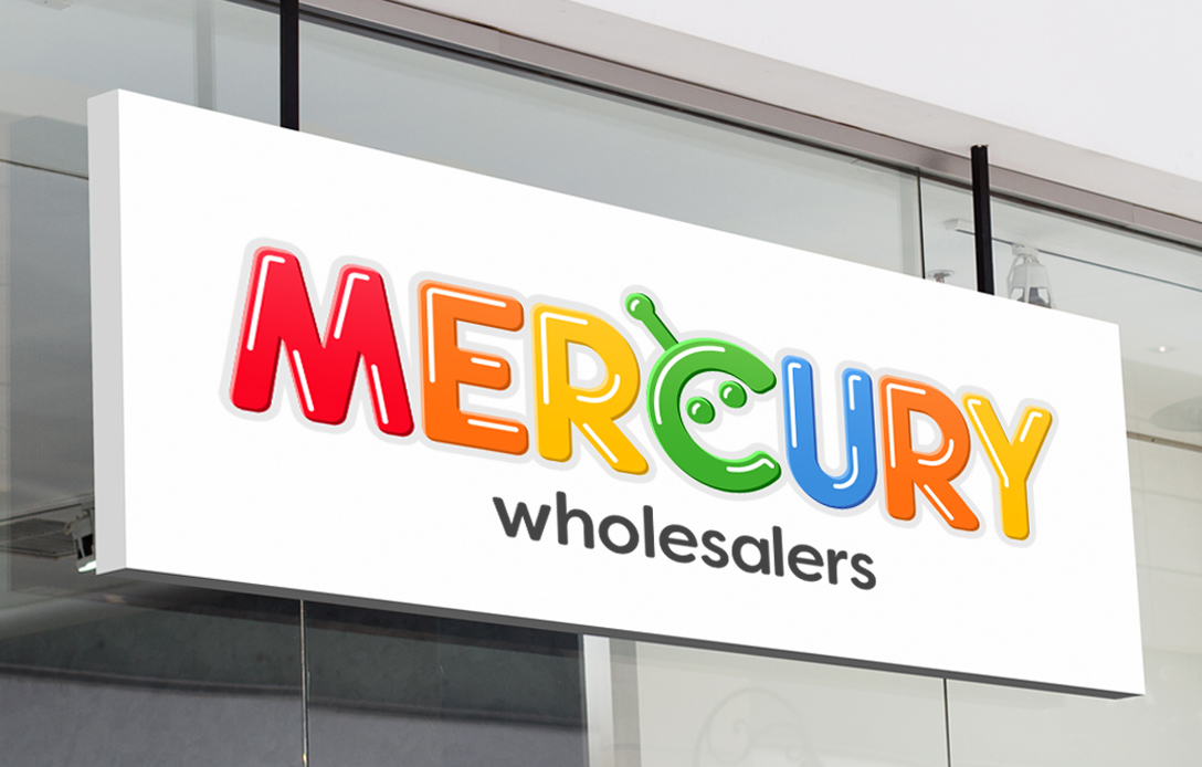
Mercury Wholesalers
LOGO DESIGN
Mercury Wholesalers had a very old, plain text based logo, they wanted a bright and colorful logo with an icon incorporated that linked them to being a toy store. They were super happy with the end result and of course so were we.
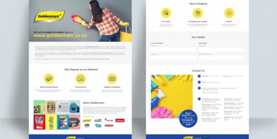
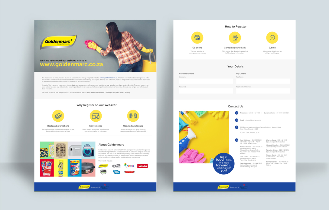
Goldenmarc Trade Presenter
GRAPHIC DESIGN
Clean, fresh and simple design for Goldenmarc's Trade Presenter.
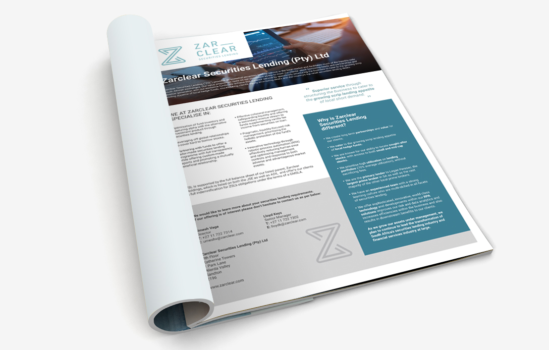
Zarclear Marketing Advert
GRAPHIC DESIGN
Simple, clean and bold magazine advert for our Zarclear client.
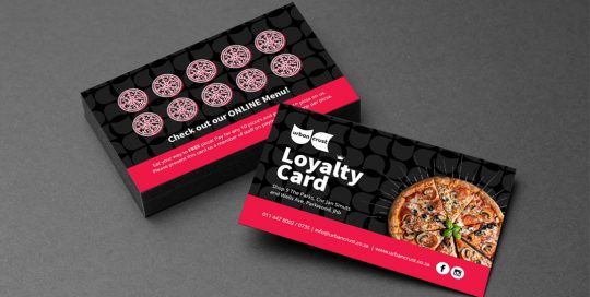
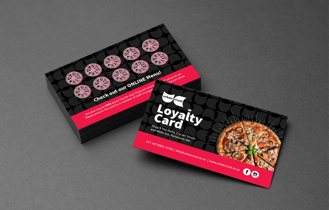
Urban Crust Loyalty Cards
GRAPHIC DESIGN
Urban Crust make some of the best pizza's in joburg. This client needed eye catching loyalty cards, flyers and table talkers.
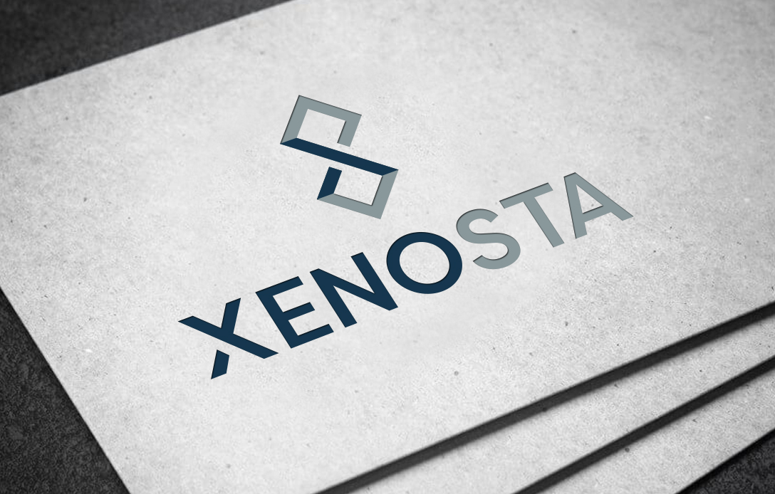
Xenosta
LOGO DESIGN
Xenosta is an investments business, they wanted a striking logo that combined the letters X and S to create a unique icon that conveys growth, experience and credibility. They were very pleased with their clean and professional logo.
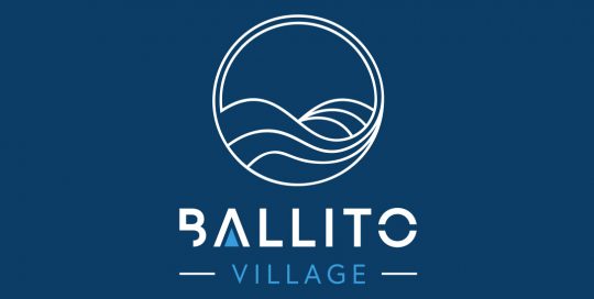
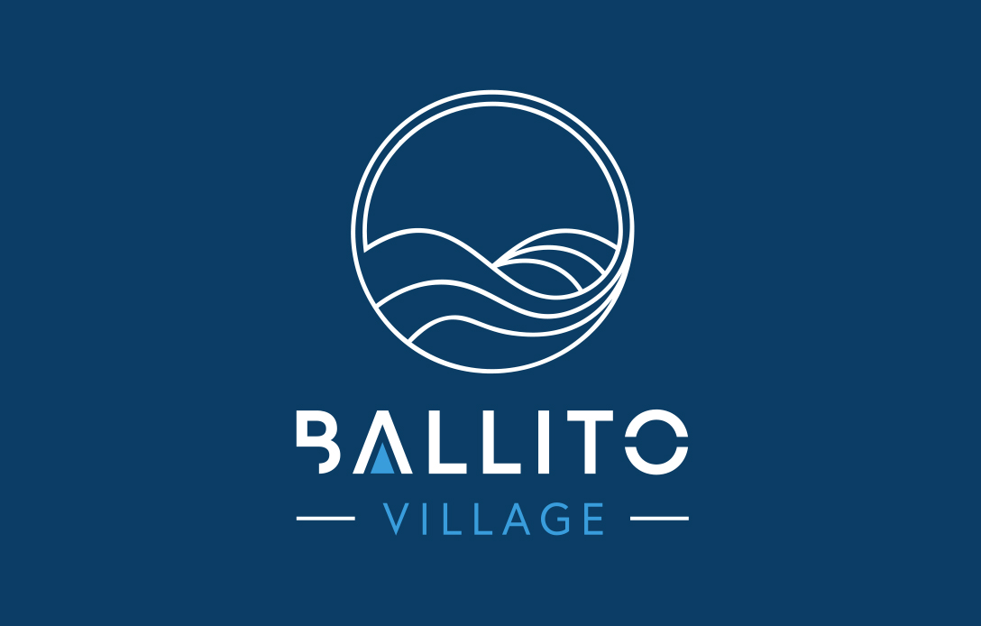
Ballito Village
LOGO DESIGN
Ballito Village is a new development of apartments in the heart of Ballito. Client wanted their logo to focus on relaxation, beach and serenity which would appeal to young families, buyers and investors, and to create a feeling of something new, cool and fresh, which is exactly what we gave them. Another very happy client.
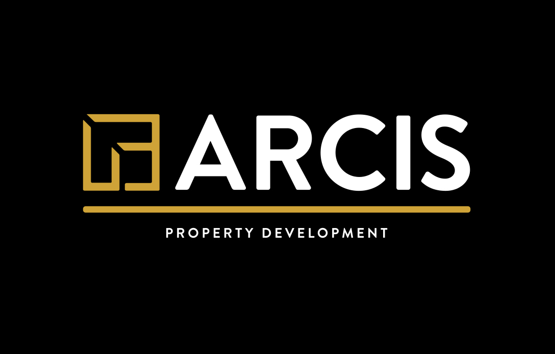
Arcis Property Development
LOGO DESIGN
The name Arcis is latin for a citadel, so client wanted an icon that represents a fortress or castle. The logo had to be bold, brave and brilliant and include golds. It needed to convey security, knowledge and wisdom to their clients. They were very happy with the end result!